Plot correlation matrix ellipses
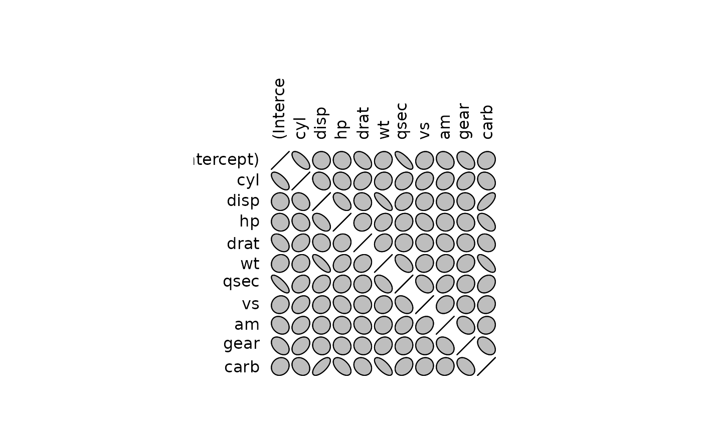
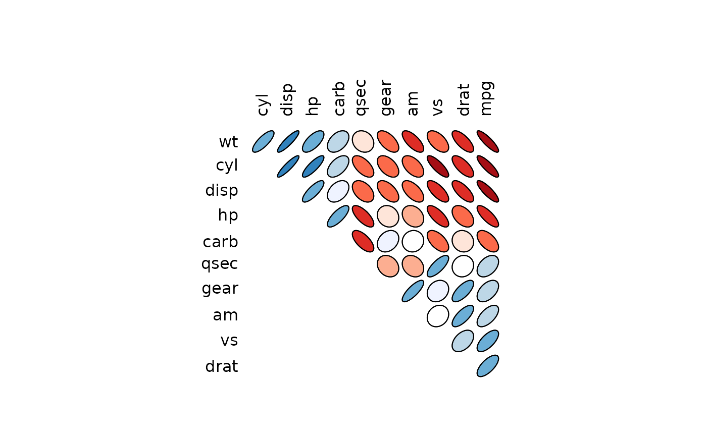
plotcorr.RdThis function plots a correlation matrix using ellipse-shaped glyphs for each entry. The ellipse represents a level curve of the density of a bivariate normal with the matching correlation.
Arguments
- corr
A matrix containing entries between
-1and1to be plotted as correlations.- outline
Whether the ellipses should be outlined in the default colour.
- col
Which colour(s) to use to fill the ellipses.
- numbers
Whether to plot numerical correlations in place of ellipses. If numbers is
TRUE, then the correlations will be rounded to a single decimal place and placed on the plot.- type
Character. Plot
"full"matrix or just"upper"or"lower"triangular part of it.- diag
Logical. Plot diagonal elements or not.
- bty, axes, xlab, ylab, asp, mar, cex.lab, ...
Graphical parameters which will be passed to
plotwhen plotting.- cex
Graphical parameter which will be passed to
textwhen plotting.
Details
The ellipses being plotted will be tangent to a unit character square,
with the shape chosen to match the required correlation. If numbers = FALSE,
the col vector will be recycled to colour each of the ellipses; if
TRUE, it will be ignored.
References
Murdoch, D.J. and Chow, E.D. (1996). A graphical display of large correlation matrices. The American Statistician 50, 178-180. doi:10.2307/2684435 .
Examples
save.par <- par(ask = interactive())

# Plot the correlation matrix for the mtcars data full model fit
data(mtcars)
fit <- lm(mpg ~ ., mtcars)
plotcorr(summary(fit, correlation = TRUE)$correlation)


# Plot a second figure with numbers in place of the
# ellipses
plotcorr(summary(fit, correlation = TRUE)$correlation, numbers = TRUE)


# Colour the ellipses to emphasize the differences.  The color range
# is based on RColorBrewer's Reds and Blues (suggested by Gregor Gorjanc)

corr.mtcars <- cor(mtcars)
ord <- order(corr.mtcars[1,])
xc <- corr.mtcars[ord, ord]
colors <- c("#A50F15","#DE2D26","#FB6A4A","#FCAE91","#FEE5D9","white",
            "#EFF3FF","#BDD7E7","#6BAED6","#3182BD","#08519C")
plotcorr(xc, col=colors[5*xc + 6])


plotcorr(xc, col=colors[5*xc + 6], type = "upper")

plotcorr(xc, col=colors[5*xc + 6], type = "lower", diag = TRUE)

par(save.par)